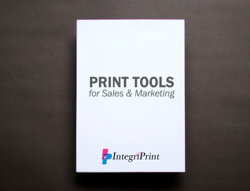
Booklets are a professional way to display a lot of different types of information. A product catalog, a project portfolio, a brand’s story and more can be crafted into a sophisticated marketing and branding piece for all businesses.
As a brand, you want your target audience and existing clients to hold on to your booklet. The most creative way to make this happen is to design a booklet that is not only worth reading, but also adds another sensation such as the look and feel of the booklet. To achieve that, you have to consider a few important elements of the booklet making process.
Would your book look good or be noticeable sitting on a table or placed on a book shelf? When building a booklet from scratch, there are three important elements that come into consideration and can determine that quality and professionalism of your finished printed piece.
- Why paper type matters
The type of paper that is used for a booklet sets the foundation for overall tone of the brand. A gloss or semi-gloss paper allows for the inks to be bold and expressive, while a matte finished paper keeps the visual content softer and more muted.
When choosing a paper weight for a booklet, the common way to build the booklet is by using both cover stock and text weight. A cover stock paper gives the cover of your booklet a thicker paper than standard copy paper and offers more durability, allowing it to hold up to the normal wear and tear. When building the inside pages of the booklet, text weight paper offers a slightly thinner paper than a cover stock, but is still durable and provides a quality print compared to standard copy paper.
- Printing applications and impressions
Traditional printing involves combining the colors CMYK for text and images used within a booklet. Brands can build a theme around a color scheme using a combination of colors. When choosing your color scheme for your booklet, be aware how color can affect the overall tone of the booklet and create a certain impression to the reader. Do you want the reader to be excited or in a happy mood when reading your booklet? Using bright vibrant colors can help create that tone. If you prefer something more classic and subtle, an array of dark colors or black with white can offer that message and tone as well.
A popular print application used in today’s booklets and general print projects is called soft touch. This application brings in the sense of touch to a printed piece by adding a velvet feeling coating to the cover of the booklet. When a reader holds a soft touch printed booklet, there is a significant difference in holding that compared to a traditionally printed booklet cover. This makes for a memorable experience and helps brand stand out.
A third and unique application for printing booklet covers is called spot coating. This application allows a brand to implement two layers of printing: one standard print layer on the paper with a second print layer over the top. The second print layer is only on certain areas of the paper. This creates a separation between elements on the cover and helps words or graphics stand out through a semi-gloss second layer of print. Another spot coating application includes applying textures to certain areas of a booklet cover. Adding a sandy texture to a beach scene allows the reader to see and physically feel the sand that was printed on the booklet.
- Versatility in booklet bindings
There are several ways to binding a booklet and each binding has their own uniqueness and visual appearance. There is no right binding to use, but the look and functionality of it can make a difference when applied to your booklet project.
The most common and inexpensive binding for booklets is called a saddle stitch. This binding is when a booklet is printed, folded and then a set of staples are fastened to the paper on the fold line. Catalogs, brochures and instruction booklets are common types of booklets that utilize saddle stitch and this binding paired with a soft touch coated cover is a step above any other standard printed and folded booklet out there.
Square back binding is similar to saddle stitch, but instead of the paper being folded with a pointed binding, square back binding squares off the pointed binding into a more “book end” look. The only downfall to considering this binding process is that a certain number of pages are needed to fill the square back binding. If you are creating a booklet with less than 20 pages, you more than likely cannot utilize this binding for your booklet.
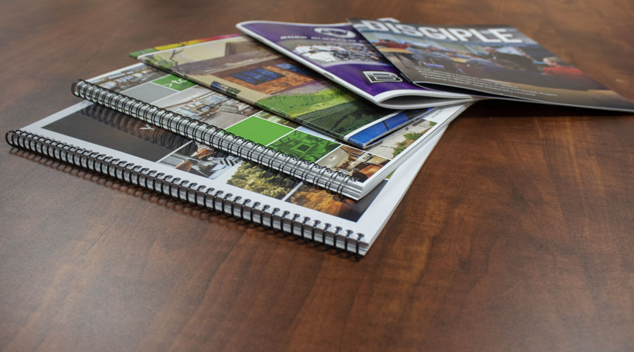
Spiral bound binding is another common form of booklet binding. It is used for almost any application including; portfolios, presentations, catalogs, manuals and more. The unique functionality of spiral bound booklets allows the reader to fold the booklet in half providing more than one way the reader can interact with the book.
Wire binding is similar to spiral bound, both being available in multiple colors and also being used for similar applications (portfolios, presentations, catalogs, manual, etc.). Wire binding is made of a metal material, where traditional spiral bound booklets are made with a plastic. The argument is split on which binding holds up better, but a wire bound booklet looks more professional to the reader, being made of a more “durable” material.
How will you build your next booklet to represent your brand effectively? We are here to help businesses look great through our large array of print solutions that include booklets. Contact IntegriPrint today to start a conversation on your next project: (763) 682-3750 | clientcare@integriprint.com

